labellec

About Caroline

This author has not yet filled in any details.
So far Caroline has created 14 blog entries.

A Week of Deep Learning

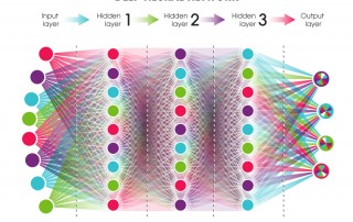
From August 21 to 25, IVADO and the MILA held their first edition of the École d'été francophone en apprentissage profond. The aim of this summer school was to "give [the participants] the theoretical and practical basis for understanding [deep learning]". A few members of the platform and myself participated to these five days of training. I must be honest, I was a little afraid of deep learning the first time it was presented to me. I found the concept [...]

By |2017-09-22T13:46:35+00:00September 22, 2017|Categories: Computer science|0 Comments

ggplot2 101 : Easy Visualization for Easier Analysis

Biological data are often easier to interpret and analyse when we can visualize them via a plot format. A good way of doing so is by exploiting the different options of ggplot2, a R plotting system. In the following post, I will present some of my go-to tricks to visualize data: nothing to fancy or to hard, perfect for both the R masters and the R beginners! The sample codes are in R and the ggplot2 library must be installed [...]

By |2017-05-19T15:08:52+00:00May 18, 2017|Categories: Data Analysis, Data Visualization, R, Uncategorized|0 Comments

Chemical Screen: Evaluating drug sensitivity

The study of the cellular response to a chemical compound is crucial to the development of new therapeutic drugs. Such an analysis is usually done by a screen experiment where the disease-specific cells (such as leukemia primary cells) are exposed to chemical compound for different concentrations. The response, in the form of sensitivity, of these cells is conventionally quantified by the IC50 or the l’EC50. Here are some notions to keep in mind when we analyze these values.  IC50/EC50 : estimate of [...]

By |2017-04-29T11:08:17+00:00February 13, 2017|Categories: Data Analysis|Tags: |0 Comments

Bootstraps and Confidence Intervals

When analyzing data, you might want or need to fit a specific curve to a particular dataset. This type of analysis can result in instructive outputs regarding the relationship between two (or more...) quantifiable parameters. The main object of this post is not how to implement such fitting, but rather how to display the goodness of such a fit i.e. how to calculate a confidence interval around a fitted curve. That being said, I will show how to do curve fitting in [...]

By |2017-04-29T18:33:55+00:00September 29, 2016|Categories: Data Analysis, R, Statistics|Tags: |1 Comment

SciPy and Logistic Regressions

Given a set of data points, we often want to see if there exists a satisfying relationship between them. Linear regressions can easily be visualized with Seaborn, a Python library that is meant for exploration and visualization rather than statistical analysis. As for logistic regressions, SciPy is a good tool when one does not have his or her own analysis script. Let's look at the optimize package                        from scipy.optimize import [...]

By |2017-04-29T16:58:35+00:00June 9, 2016|Categories: Data Analysis, Python|Tags: , |0 Comments
Go to Top