

Biological data are often easier to interpret and analyse when we can visualize them via a plot format. A good way of doing so is by exploiting the different options of ggplot2, a R plotting system. In the following post, I will present some of my go-to tricks to visualize data: nothing to fancy or to hard, perfect for both the R masters and the R beginners! The sample codes are in R and the ggplot2 library must be installed and loaded.
 install.packages("ggplot2")
 library(ggplot2)
To demonstrate the different annotation tricks, we generated some normally distributed data. Each (x,y) point is associated to a random classification Croup (Group1, Group2, Group3 or Group4) and a random classification Subgroup (GroupA or GroupB). The values and groups are stored in a data frame.
df.data <- data.frame("x" = data.x, "y" = data.y, "group" = data.group, "subgroup" = data.subgroup) Highlighting a Portion of the Data
Highlighting data can help identify and localize points among the entire dataset. It can also detect possible clusters among the data. There are two main ways of highlighting a portion of the data point. The first one is classification-specific. Remember that each of our random (x,y) point is attributed a group, we now want to attribute a specific color to each of these groups. When defining the aesthetics of the plot, i.e. the x and y values, we will specify that the color of the data point should be define by its group. The same could be done with the subgroups. This approach works well when plotting a scatter plot.
ggplot(data = df.data) +
geom_point(aes(x = x, y = y, colour = group)) 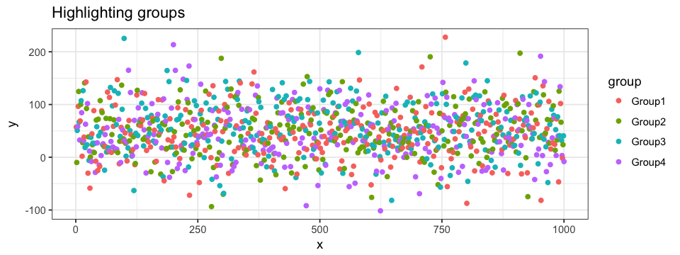
The second approach can be both group specific and value specific. To do so, we use R’s subset function. We could highlight a subset with all the points from Group1. By doing so, all the other groups are pooled in one bigger subset.
ggplot(data = df.data) +
      geom_point(aes(x = x, y = y)) +
      geom_point(data = subset(df.data, group == "Group1"),
            aes(x = x, y = y),
            colour = "pink")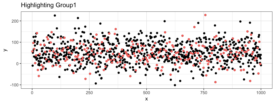
It is also possible to define a subset of a subset, allowing us to highlight data point even more precisely. For example, we could highlight the points within some range on both the x- and y-axis. When doing so, we can superpose different layers of points: one with all the data (black) and one with only a subset of the data (colored). In this case, the order of the layer are important (try to interchange the two geom_point layers in the code below…).
ggplot(data = df.data) +
      geom_point(aes(x = x, y = y)) +
      geom_point(data = subset(subset(data = df.data, y > 0 & y < 100), x > 250 & x < 375),
            aes(x = x, y = y),
            colour = "pink")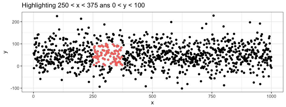
To get even more information out of our plot, we can combine the two highlighting approaches: attributing group-specific color to each points for a given range of values.
ggplot(data = df.data) +
      geom_point(aes(x = x, y = y)) +
      geom_point(data = subset(subset(data = df.data, y > 0 & y < 100), x > 250 & x < 375),
            aes(x = x, y = y, colour = group))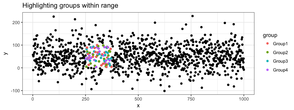
Annotating the Plot
Annotations can be very useful! I mainly use three types of annotation: data points labels, shadows and segment. I often label data points for ranges of values (extremes values for instance). It is possible to label every single point but I find the plot to be hard to interpret in those cases: I only see a cloud of words squished together! Of course, if the data is sparse, labeling all points can be highly informative. A simple way of labeling points is by adding a geom_texte layer. However, I do suggest the use of ggrepel (which must first be installed and then loaded). This packages is design to handle overlapping labels generated by geom_texte. To ease visualization, we can highlight (as described in the previous section) the points labelled.
install.packages("ggrepel")
library(ggrepel)

ggplot(data = df.data) +
      geom_point(aes(x = x, y = y)) +
      geom_point(data = subset(subset(data = df.data, x < 500 & x > 250 & < -50),
            aes(x = x, y = y),
            colour = "pink") +
      geom_texte_repel(data = subset(subset(data = df.data, x < 500 & x > 250 & < -50),
            aes(x = x, y = y, label = group), colour = "pink")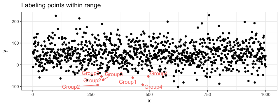
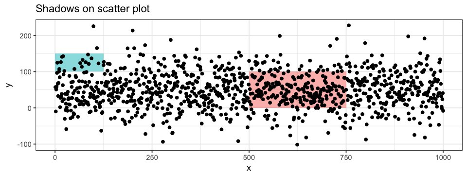
Another way to annotate a plot is by shadowing a specific region. To do so, we can use ggplot2’s annotate function. The shadow will be applied to a given section delimited by xmin, xmax, ymin and ymax values. Shadows can be informative on both scatter plot and histogram (BONUS: I also added text annotations to the histogram…). The layers order are also important here!
ggplot(data = df.data) +
      annotate("rect", xmin = 500, xmax = 750, ymin = 0, ymax = 100,
            alpha = 0.5, fill = "pink") +
      annotate("rect", xmin = 0, xmax = 125, ymin = 100, ymax = 150,
            alpha = 0.5, fill = "turquoise") +
      geom_point(aes(x = x, y = y))
ggplot(data = df.data) +
      annotate("rect", xmin = 50.28, xmax = 83.93, ymin = 0, ymax = 45,
            alpha = 0.5, fill = "pink") +
      annotate("rect", xmin = 83.93, xmax = 224.70, ymin = 0, ymax = 45,
            alpha = 0.5, fill = "turquoise") +
      annotate("text", x = 50.28, y = 48,
            label = "Q2") +
      annotate("text", x = 83.93, y = 48,
            label = "Q3") +
      geom_histogram(aes(x = y))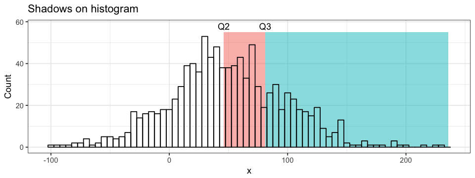
Lastly, some information such as mean, standard deviation or confidence interval bounds are best represented by segments. Their are three main functions to draw segments: geom_hline, geom_vline and geom_segment. The two firsts are for axis-intercepting segments (v for vertical and h for horizontal) whereas the third is for any kind of segment going from (x, y) to (x', y'). Axis-intercepting fragments are useful when representation mean (solid line) and bounds for example. On the other hand, if we want to link a data point to its values on both axes, we can combine to segments with (x, y) coordinates. Notice the use of Inf in the code below and its effect on the resulting plot. I prefer to define my x or y with -Inf rather than the smallest values represented on the plot: (1) you don’t have to manually find these smallest values and (2) the segments intercept the axis (by default, ggplot2 add some padding between the extreme values and the axis).
ggplot(data = df.data) +
      geom_hline(yintercept = mean(df.data$y), # for vertical intercept: geom_vline(xintercept = x)
            colour = "pink") +
      geom_segment(aes(x = 752, xend = 752, y = -Inf, yend = 145),
            colour = "turquoise",
            linetype = "dashed") +
      geom_segment(aes(x = -Inf, xend = 752, y = 145, yend = 145),
            colour = "turquoise",
            linetype = "dashed") +
      geom_point(aes(x = x, y = y))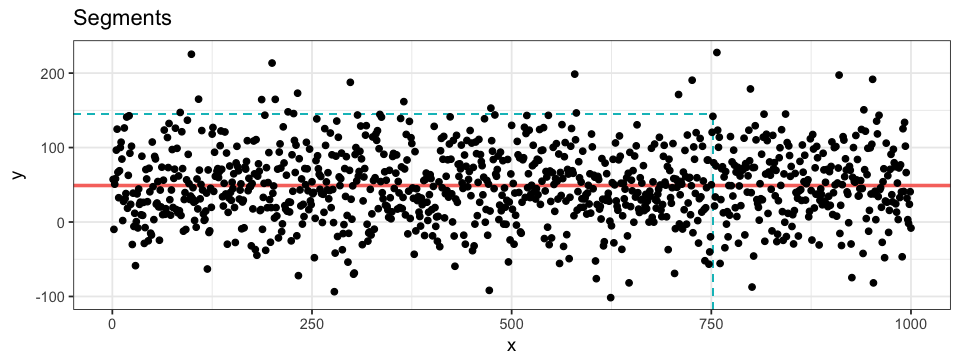
Classification-Specific Plots
In the first section, we showed how to associate group-specific color to our data. The resulting plot can something be very loaded and we end up loosing information. One way to avoid this problem is by generating a plot for every classification group. To do so, we do not have to generate new data frames nor independent plots. Instead, we can divide a single main plot into various facets containing group-specific subplots. The geom layer is define just as before: the magic is in the facet layer! facet_wrap allows us to define a single classification identifier (we will start by plotting the data points in regards to their group) and the number of columns in the main plot. Since we have 4 groups and hence 4 subplots, we will use 2 columns and the resulting plot will be arrange in a 2×2 fashion. Subplots on the same row will share a y-axis, whereas subplots in the same column will share a x-axis.
ggplot(data = df.data) +
      geom_point(aes(x = x, y = y)) +
      facet_wrap(~ group, ncol = 2)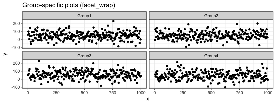
facet_grid can also be used. The main difference with grid_wrap is the subplots will either be arrange on a single row (. ~ group) or in a single column (group ~ .). ~ can be interpreted as against and . as all. Every subplot will share the same range of values for both axes. This can be changed be setting scale to either "free_x" (see code below) or "free_y". When defining a coloring attribute for the data, it will be applied throughout the different facets.
ggplot(data = df.data) +
      geom_point(aes(x = x, y = y, colour = subgroup)) +
      facet_grid(. ~ group, scale = "free_x")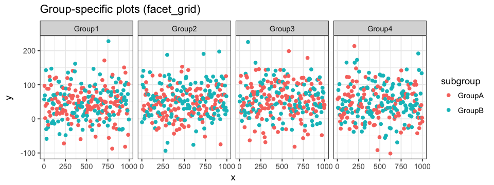
In the case where our data have classification identifiers, like in our example, we can also generate facets representing sub classifications within more general classification. For example, we could want to see the distribution of each subgroup within the different groups. To do so, we will define the facets as subgroup ~ group which will result in a main plot with 8 subplots across 2 rows (number of subgroups) and 4 columns (number of groups).
ggplot(data = df.data) +
      geom_histogram(aes(x = x, y = y, fill = group),
            colour = "black",
            binwidth = 15) +
      facet_grid(subgroup ~ group, scale = "free_x")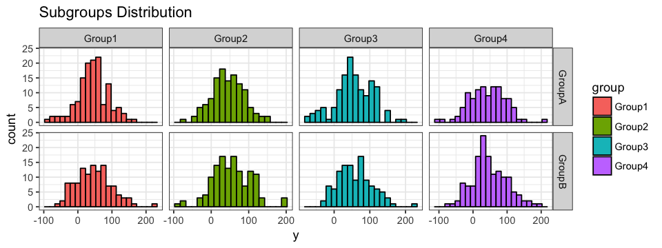
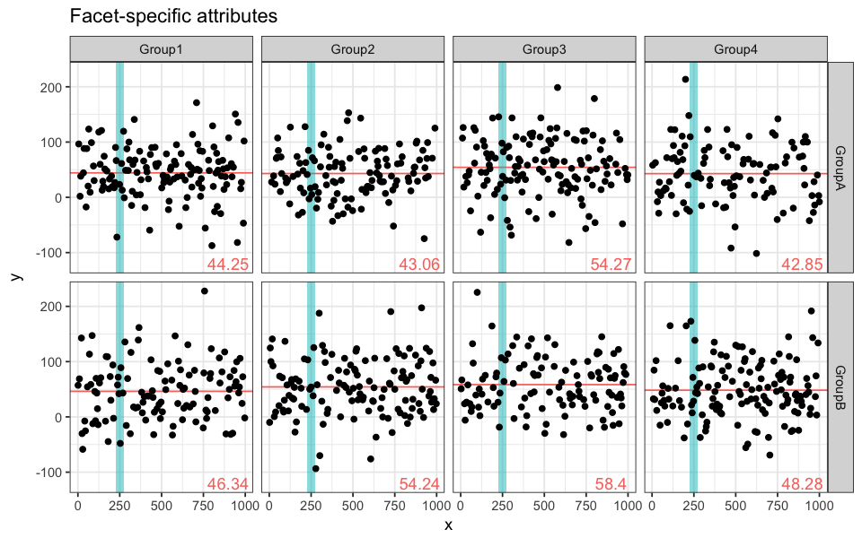
Facet-Specific Attributes
We mentioned that coloring attributes (and other attributes for that matter) are applied to every facet of the plot. In some instances, this can be useful; in others, we might want to represent facet-specific attributes. Let’s go through a simple example in which we will draw facet-specific mean segments and a common shadow.
We must first calculate the mean for every (group, subgroup) pair. To do so, we are using R’s aggregate function. This function groups values by classification identifiers and then apply a given function to the values within the subset.
mean.data <- aggregate(x = df.data$y, # use the y values
                       by = df.data[c("group", "subgroup")], # group by Group and then by Subgroup
                       FUN = function(x) {
                           signif(mean(x), 4) # calculate the mean keep 4 significant numbers
                           }
                       )
To facilitate the manipulation of our mean.data data frame and avoid confusion, let’s rename the columns.
colnames(mean.data) <- c("group", "subgroup", "average")It is now time to generate the plot!
ggplot(data = df.data) +
      # y-intercept for facet-specific average
      geom_hline(data = mean.data,
            aes(yintercept = average), # column of mean.data
            colour = "pink") +

      # writing the facet-specific average
      annotate("text", x = 900, y = -120, # bottom right corner of facet
            label = mean.data$average,
            colour = "pink") +

      # shadow common to all facets
      annotate("rect", xmin = 225, xmax = 275, ymin = -Inf, ymax = Inf,
            alpha = 0.5,
            fill = "turquoise") +

      # data points
      geom_point(aes(x = x, y = y)) +

      # facets
      facet_grid(subgroup ~ group, scale = "free_x)
The turquoise shadow is the same for the 8 subplots, but they each have a different pink y-intercept and a different mean value.
The tricks presented in this post only represent a small fraction of what R can offer when it comes to data visualization! They are however very useful and most of them are easy to implement: they can easily be used as a starting point when analyzing new data!
Leave A Comment