

When analyzing data, you might want or need to fit a specific curve to a particular dataset. This type of analysis can result in instructive outputs regarding the relationship between two (or more…) quantifiable parameters. The main object of this post is not how to implement such fitting, but rather how to display the goodness of such a fit i.e. how to calculate a confidence interval around a fitted curve. That being said, I will show how to do curve fitting in R, using different libraries, but will not go into much details. If you are interested in learning more about curve fitting, you can look into the SciPy (Python), Theano (Python) and CRAN (R) documentation. SciPy functions and CRAN packages can be easy to use, whereas Theano can be less trivial.
Let’s start with a simple dataset of response through time. On our x-axis, we have the time that have elapsed in minutes, and on our y-axis, we have the response. The values are saved in the variables x and y respectively.
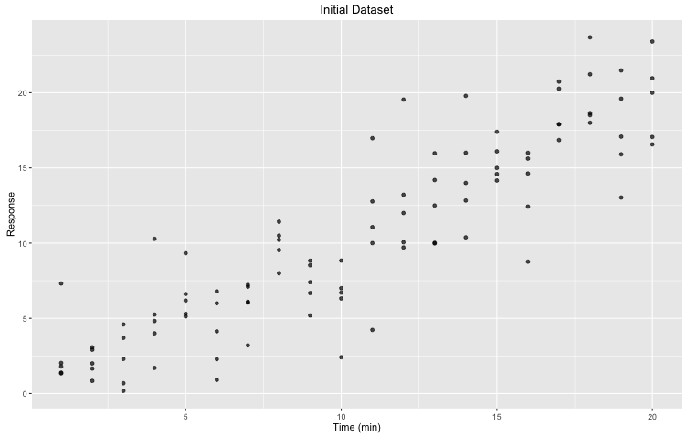
Figure 1. Initial dataset: Response through time (minutes) with five (5) replicates for each time point.
Given this data and previous knowledge on the trend that we should observe, we would like to fit a nonlinear model to this relationship. More precisely, we want to fit $ y = ax^{2} + b $. The actual fitting can easily be done using R nls function. Here, we are using a least square approach. Given a function to.fit and a set of observed data (x, y ), nls will estimate values for our two parameters a and b.
fit <- nls(y ~ to.fit(x, a, b), start = list(a = 1.0, b = 1.0))The output is presented as a table from which we can easily retrieve the estimates and some statistics. We now have our yfit or our fitted curve!
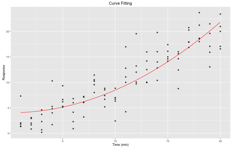
Figure 2. Curve fitting: nonlinear least square fitting of a pre-defined expression to our initial dataset using R nls function. We used predict(fit) to generate the yfit. In red is the fit.
That is a pretty graph! However, how can we evaluate the goodness of our fit? How do we know that our data is indeed following the expected trend? Rather than solely using our eyes and gut feeling, let’s bootstrap! In other words, we will repeat our fitting m times using n data points from our initial dataset, and derive a confidence interval from all these new curves. To do so, we will be using two R libraries: broom and dplyr. You might have to install the packages before importing the libraries themselves (forgetting this step could lead to error and plenty of frustration). broom has an automated bootstrap function that can save you a lot of time.
boot <- 1000
set.seed(2000)
df <- data.frame("x" = x, "y" = y)
We first need to define how many times we want to loop around our fitting. A larger boot usually require more time to run, but might also result in more accurate confidence interval. Here, we will be working with 1,000 bootstraps.
bt <- df %>% bootstrap(boot) %>%
 do(tidy(nls(y ~ to.fit(x, a, b), ., start = list(a = 1.0, b = 1.0))))
In this step, we are asking to do $m = boot$ curve fittings. Each curve fitting will be done on a ‘new’ dataset, which will be constructed by randomly selecting $n$ data points from our initial dataset, where $n$ is the number of data points in the initial dataset. When doing this random selection, we are allowing repeats. Once this ‘new’ dataset is built, we apply the same fitting approach as before. In the end, we will have $m$ estimates for each of our parameters.
bt.all <- df %>% bootstrap(boot) %>%
 do(augment(nls(y ~ to.fit(x, a, b), ., start = list(a = 1.0, b = 1.0)), .))
Compared to the snippet presented above where we are only getting the parameters estimates, here we are generating the yfit values of every single bootstrap samples. With these values and their correspond x , we are able to plot the different bootstrap curves. Note here that the x are bootstrap specific and do not correspond to our initial x .
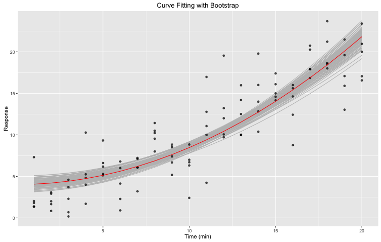
Figure 3. Curve fitting with bootstrap: nonlinear least square fitting of our initial data set to a pre-defined expression using R nls function. Bootstrapping was done 1,000 times using the bootstrap function of the broom R library. In red is the fit. In gray are the different bootstraps.
The gray area defined by the various bootstraps can be useful when evaluation the goodness of our fit. That being said, it is not always enough: in some instances, we might have aberrant curve(s). For example, one bootstrap sample might be composed of $n$ times the same point, resulting in a weird, offset curve. We do not want these curves, but we can’t just remove them manually. First, it would not be as simple as one might think, and second, we can’t manipulate our data in such a way. Instead, we will generate a confidence interval!
We need to generate a table fitted where the columns are the x values of our original dataset, and where the rows are the yfit for every bootstrap. Be careful here: the yfit are in calculated using the initial x rather then the corresponding bootstrap x . This means that we can not use the same yfit as those plotted! We need to go back to our parameters estimates, and using these, calculate each and every yfit using our initial x.
alpha <- 0.05
lower <- (alpha / 2) * boot
upper <- boot - lower
We will be computing a 95% confidence interval with lower and upper bounds. Again, working with a larger boot might be easier. Let say that we have $boot = 100$. When calculating the bounds we will get $ lower = \frac{0.05}{2} 100 = 2.5$ and $upper = 100 – 2.5 = 97.5$. For computational reasons, both lower and upper bounds would be rounded resulting in a confidence interval that is not exactly of 95%. When using $boot ≥ 1,000$ we do not have this problem.
ci.sorted <- apply(fitted, 2, sort, decreasing = F)We now individually sort the columns of our table in increasing order. Hence, for every x we have the maximal and minimal values generating via bootstrap.
ci.upper <- ci.sorted[upper,]
ci.lower <- ci.sorted[lower,]
And now we build the actual interval. Our lower bound is defined by the values of the row corresponding to our calculated lower. Since the columns are in increasing order, this row represent our $\frac{\alpha}{2}$ threshold. Inversely, the upper row will represent our $1 – \frac{\alpha}{2}$ threshold.

Figure 4. Curve fitting with 95% confidence interval: nonlinear least square fitting of our initial data set to a pre-defined expression using R nls function. Bootstrapping was done 1,000 times using the bootstrap function of the broom R library. Confidence interval was derived from bootstrap results In red is the fit. In dotted are the upper and lower bounds of the confidence interval.
So there you go! You now have a better idea of how good is your fitting!
What a great article Caroline !