Data Visualization

Dimensionality Reduction Tutorials: 1- Principal Components Analysis

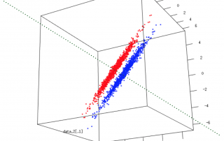
Understanding dimensionality reduction If you use large datasets (transcriptomes, whole genome sequencing, proteomes), sooner or later you will stumble across something called Principal Components Analysis (PCA). PCA is a dimensionality reduction, a family that encompasses many techniques that do just that: reduce the dimensionality. But what does that mean? What are dimensions and why would we want to reduce their number? How about we deal with these questions through an example? The problematic Say we have a hypothetical transcriptome, of a [...]

By |2017-06-26T13:36:29+00:00June 1, 2017|Categories: Data Analysis, Data Visualization|1 Comment

ggplot2 101 : Easy Visualization for Easier Analysis

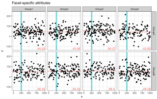
Biological data are often easier to interpret and analyse when we can visualize them via a plot format. A good way of doing so is by exploiting the different options of ggplot2, a R plotting system. In the following post, I will present some of my go-to tricks to visualize data: nothing to fancy or to hard, perfect for both the R masters and the R beginners! The sample codes are in R and the ggplot2 library must be installed [...]

By |2017-05-19T15:08:52+00:00May 18, 2017|Categories: Data Analysis, Data Visualization, R, Uncategorized|0 Comments

Create a nice looking table using R

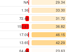
Hi everyone, Today I will introduce formattable. This package is designed for applying formatting on vectors and data frames to make data presentation easier, richer, more flexible and hopefully convey more information. We will see how to use this package to interpret your data at a glance, with just a few lines of code (You can follow along below as well as check all the code in my git). Before going further, I will specify that this package is generally used [...]

By |2017-10-25T10:14:46+00:00March 30, 2017|Categories: Data Visualization, R|Tags: , |9 Comments

Introduction to cowplot to combine several plots in one with R

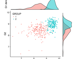
Hi everyone, Today I will introduce cowplot, an extension of ggplot2 library. Some helpful extensions and modifications to the 'ggplot2' package. In particular, this package makes it easy to combine multiple 'ggplot2' plots into one and label them with letters, e.g. A, B, C, etc., as is often required for scientific publications. As you can see, this library can be useful to easily create a figure containing multiple plots. But we will see how we can use it to create [...]

By |2017-04-29T16:22:55+00:00November 28, 2016|Categories: Data Visualization, R|0 Comments

Standard deviation on a correlation scatter plot

I was recently asked by a colleague to provide visualization of differential gene expression computed using RPKM values (two samples, no replicates) and highlight genes that were outside the distribution by 2 standard deviations or more. As a first draft, I quickly obliged by calculating the fold change distribution, computing standard deviation and drawing lines on either side of the diagonal to obtain: This turns out to be equivalent to computing the standard deviation of the residual of a linear [...]

By |2017-04-29T17:05:35+00:00April 5, 2016|Categories: Data Visualization, R, Statistics|Tags: |3 Comments
Go to Top