


Hi everyone,
Today I will introduce cowplot, an extension of ggplot2 library.
Some helpful extensions and modifications to the ‘ggplot2’ package. In particular, this package makes it easy to combine multiple ‘ggplot2’ plots into one and label them with letters, e.g. A, B, C, etc., as is often required for scientific publications.
As you can see, this library can be useful to easily create a figure containing multiple plots. But we will see how we can use it to create more complex plots very efficiently throw a simple example. (You can follow along below as well as check all the code in my git)
Loading library and create some data
In this example, we first load two libraries: ggplot2 and cowplot. Then we need to generate expression level for two genes in two groups. To be interesting, the first gene will have an expression significantly different between the two groups (it’s not the case for the second gene).
library("ggplot2")
library("cowplot")

g1 = c(rnorm(200, mean=350, sd=100), rnorm(200, mean=700, sd=100))
g2 = c(rnorm(200, mean=350, sd=100), rnorm(200, mean=500, sd=100))
group = as.factor(rep(c(1,2), each=200))
df_exp = data.frame(G1=log2(g1 + 1) , G2=log2(g2 + 1), GROUP=group)
Create each plot independently
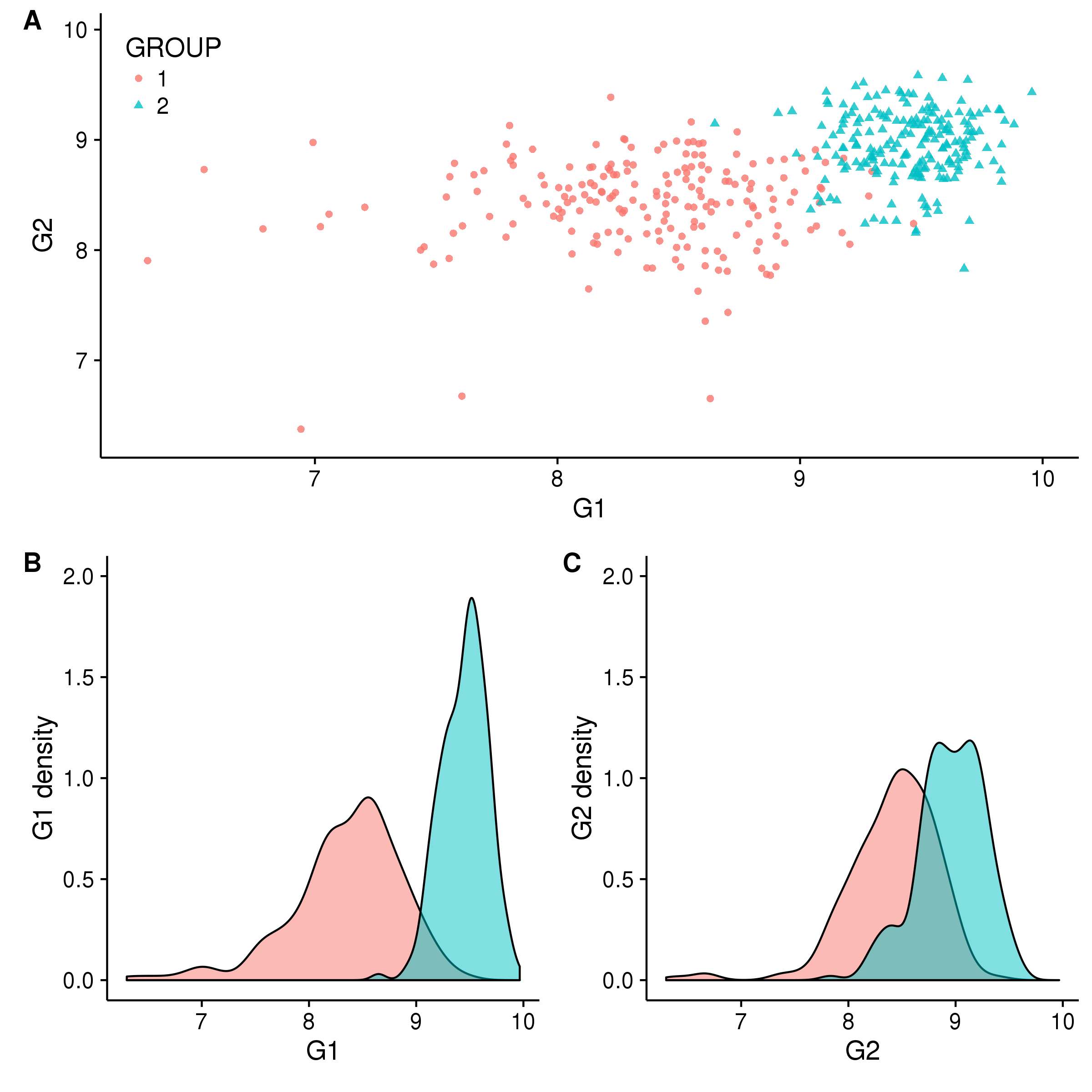
We start by displaying each information in distinct plots. The trick here is to save each plot into variables to allow us to manipulate them in next steps. For this example, we choose to display a scatterplot of genes expression and the distribution for each group and each gene.
gg_scatter = ggplot(df_exp, aes(G1, G2, color=GROUP, shape=GROUP)) + geom_point(alpha=.8)

gg_dist_g1 = ggplot(df_exp, aes(G1, fill=group)) + geom_density(alpha=.5)
gg_dist_g1 = gg_dist_g1 + ylab("G1 density")

gg_dist_g2 = ggplot(df_exp, aes(G2, fill=group)) + geom_density(alpha=.5)
gg_dist_g2 = gg_dist_g2 + ylab("G2 density")
Different ways to combine plots, with plot_grid
Now we want to combine these three plots into one. The first way to do this is to collapse them in one line and add labels to identify them in the main text or in the legend. With cowplot, this can be done very simply in one line with the function plot_grid and two parameters: nrow/ncol, labels
plot_grid(gg_scatter, gg_dist_g1, gg_dist_g2, nrow=1, labels=c('A', 'B', 'C')) #Or labels="AUTO"
Figure 1. A)Two groups comparison function to G1 and G2 expression. B)Distribution of G1. C)Distribution of G2.
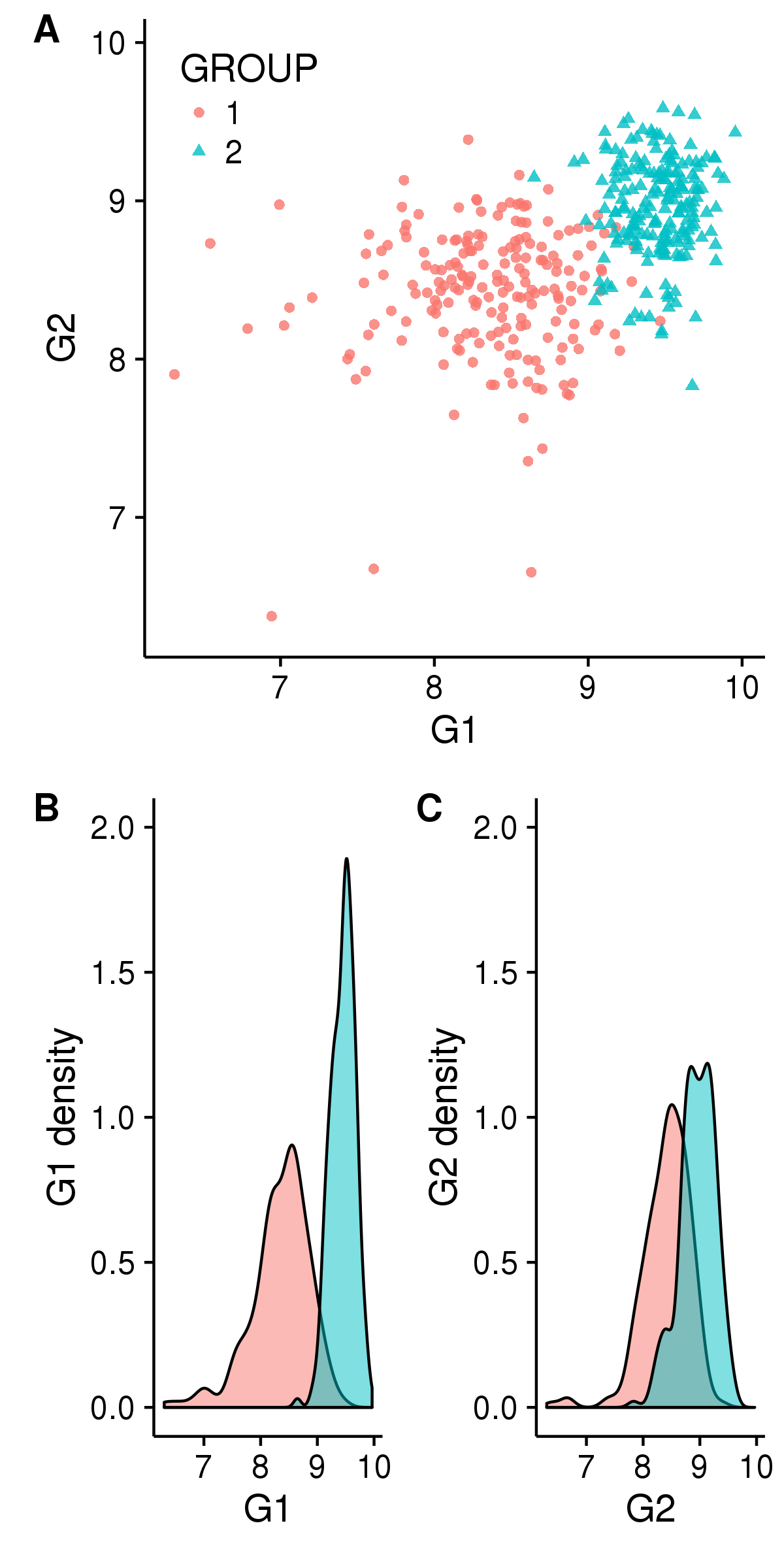
When we collapse several plots, we need to check that information is not duplicated (like legends). Also, to simplify the interpretation, it’s generally better if shared axes have the same scale in all plots. In our case, we can fix these points with the code below.
# Avoid displaying duplicated legend
gg_dist_g1 = gg_dist_g1 + theme(legend.position="none")
gg_dist_g2 = gg_dist_g2 + theme(legend.position="none")

# Homogenize scale of shared axes
min_exp = min(df_exp$G1, df_exp$G2) - 0.01
max_exp = max(df_exp$G1, df_exp$G2) + 0.01
gg_scatter = gg_scatter + ylim(min_exp, max_exp)
gg_scatter = gg_scatter + xlim(min_exp, max_exp)
gg_dist_g1 = gg_dist_g1 + xlim(min_exp, max_exp)
gg_dist_g2 = gg_dist_g2 + xlim(min_exp, max_exp)
gg_dist_g1 = gg_dist_g1 + ylim(0, 2)
gg_dist_g2 = gg_dist_g2 + ylim(0, 2)
Also we can decide to move B and C in an other line to build our figure according to the types of graphs. Again, there are different ways to do this. Below, we decided to create each line separately and collapse then in 1 column with the function plot_grid (from cowplot) :
first_row = plot_grid(gg_scatter, labels = c('A'))
second_row = plot_grid(gg_dist_g1, gg_dist_g2, labels = c('B', 'C'), nrow = 1)
gg_all = plot_grid(first_row, second_row, labels=c('', ''), ncol=1)

# Display the legend
gg_scatter = gg_scatter + theme(legend.justification=c(0, 1), legend.position=c(0, 1))
 |
 |
Export your figure in a file
To export or save your figure in a file and be sure to scale the overall figure size such that the individual figures look the way they do, cowplot propose to use the function save_plot, with the parameter base_height/base_width and ncol/nrow.
# With ncol=nrow=1, we specify that the figure (gg_all) is in one block with a base_height=8
# In this case A need to be resized to fit with the width of B + C (calculated relative to height)
save_plot("./all_v2.png", gg_all, base_height=8, ncol=1, nrow=1) #Figure 2

# Here, the figure has 2 blocks separated by rows and each row have a base_heigth=4
# In this case B and C need to be resized to fit the width of A
save_plot("./all_v3.pdf", gg_all, base_height=4, ncol=1, nrow=2) #Figure 3
And as you can notice, specifying the extension of the file in the filename defines the type of file that will be produced. You don’t need to use a particular function for each type; no more of png(), pdf()…
All in 1!
Sometimes merging all your plots can create a more attractive figure, like the one at the beginning of this blog post. But (for some of us) this kind of figure can be complex to create with tools like illustrator and others. If it’s your case, ggplot2+cowplot can be a good alternative. You can create this figure by adding just a few lines to the code above:
# Flip axis of gg_dist_g2
gg_dist_g2 = gg_dist_g2 + coord_flip()

# Remove some duplicate axes
gg_dist_g1 = gg_dist_g1 + theme(axis.title.x=element_blank(),
				axis.text=element_blank(),
				axis.line=element_blank(),
				axis.ticks=element_blank())

gg_dist_g2 = gg_dist_g2 + theme(axis.title.y=element_blank(),
				axis.text=element_blank(),
				axis.line=element_blank(),
				axis.ticks=element_blank())

# Modify margin c(top, right, bottom, left) to reduce the distance between plots
#and align G1 density with the scatterplot
gg_dist_g1 = gg_dist_g1 + theme(plot.margin = unit(c(0.5, 0, 0, 0.7), "cm"))
gg_scatter = gg_scatter + theme(plot.margin = unit(c(0, 0, 0.5, 0.5), "cm"))
gg_dist_g2 = gg_dist_g2 + theme(plot.margin = unit(c(0, 0.5, 0.5, 0), "cm"))

# Combine all plots together and crush graph density with rel_heights
first_col = plot_grid(gg_dist_g1, gg_scatter, ncol = 1, rel_heights = c(1, 3))
second_col = plot_grid(NULL, gg_dist_g2, ncol = 1, rel_heights = c(1, 3))
perfect = plot_grid(first_col, second_col, ncol = 2, rel_widths = c(3, 1))

save_plot("./perfect.png", perfect, base_height=6)
To conclude
This is just an introduction to the library cowplot. I’ve just mentioned 2 functions! In this library you can find more, like draw_plot to places a plot somewhere onto the drawing canvas. I use this function to overlay several plots, it can be useful when you want change the colour of the background based on a parameter. So if you want to go further, I recommend checking the vignettes or/and the manual here and let your imagination speak.
Leave A Comment