

Sébastien’s last post presented a hard-to-understand graph. The Venn diagram with four sets is a good example of visualization gone wrong. Good practices in data visualization is a hot topic right now. Not just in science, but in multiple areas such as journalism and business intelligence. Indeed, the crowd was quite heterogeneous at the first Visualisation Montréal meeting in August where more than 100 persons showed up! And the free ebook that was launched at the meeting targets beginners from all fields.
Even if the type of data differs among the fields (we don’t use geographic maps that often in bioinformatic!), the basic principles behind a good representation are pretty much always the same. I came across an interesting editorial from Nicolas Rougier, recently published in Plos One which summarizes some of the best practices in ten simple rules.
Here they are :
- Know Your Audience
- Identify Your Message
- Adapt the Figure to the Support Medium
- Captions Are Not Optional
- Do Not Trust the Defaults
- Use Color Effectively
- Do Not Mislead the Reader
- Avoid “Chartjunk”
- Message Trumps Beauty
- Get the Right Tool
Rules 1 and 2 deserve their top places. I would have put them at the top of the list myself. These rules are essential to create a successful visual with a message that is not only clear to you but to your target audience as well.
Actually, putting too much data on a graph and letting your audience deal with the overload of information is a lot easier than carefully thinking about what your message should be and how to present it effectively. Trust me on that. Stepping back and thinking about the information needed to support the story underneath the data is necessary and usually leads to a more impacting figure. Here, laziness does not pay!
Go read the article, it might save you some time and energy in the future! And besides, it has nice visual examples.
And for more inspiration (and/or continue learning), check out the work of field pioneers Edward Tufte and John Tukey. Edward Tufte is the one who introduced the concept of “data-to-ink ratio” and has significantly contributed to the emergence of the field.
Closer to us, look at Martin Krzywinski‘s website. He’s the creator of the now widely used Circos plot. His website contains a lot of interesting presentations.
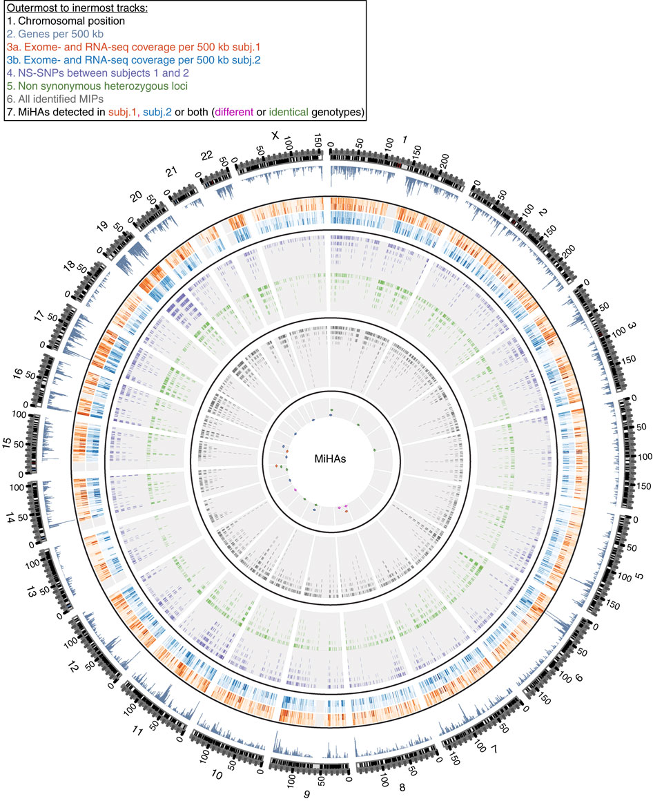
Figure1. Circos plot from Diana Paola Granados et al article.
Leave A Comment