

I was recently reading a paper (a very inspiring read mapper for RNA-Seq!). At some point the authors wanted to present the overlap between splice junctions detected by 4 RNA-Seq read mappers and choose to do so using the ubiquitous Venn diagram (see Fig. 1). I spent a few minutes staring at this colorful mosaic… without gaining much insight.
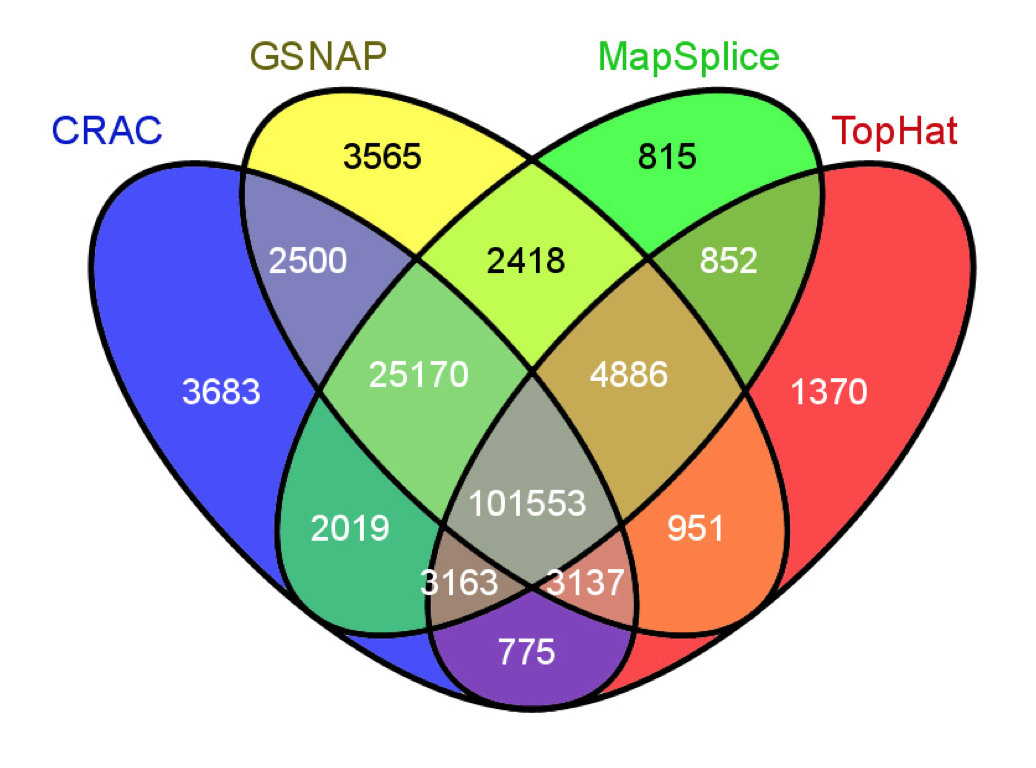
Fig. 1: Example of a four-way Venn diagram. Reproduced from figure 4b of Genome Biology, 14(3):R30, 2013.
Which mappers overlapped most in their predicted junctions? Is there any mapper acting as an outlier to the group? What is the proportion of junctions that are differentially called by the mappers? Try to see how you would attempt to answer these questions using the diagram reproduced in Fig. 1.
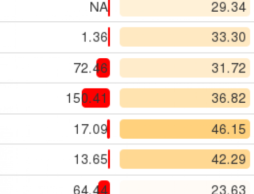
I pulled the numbers and tried to work out an alternative presentation to better explore these results, Fig. 2 shows a crude snapshot of my work-in-progress spreadsheet. From it, it is straightforward to see that 65% of the junctions are identified by all mappers (good news!). TopHat is the big outlier, CRAC, GSNAP and MapSplice have more than 86% of junctions in common. Only a tiny fraction are unique to any mapper (1-2%). MapSplice seems the most conservative of the four (only 815 unique junctions).
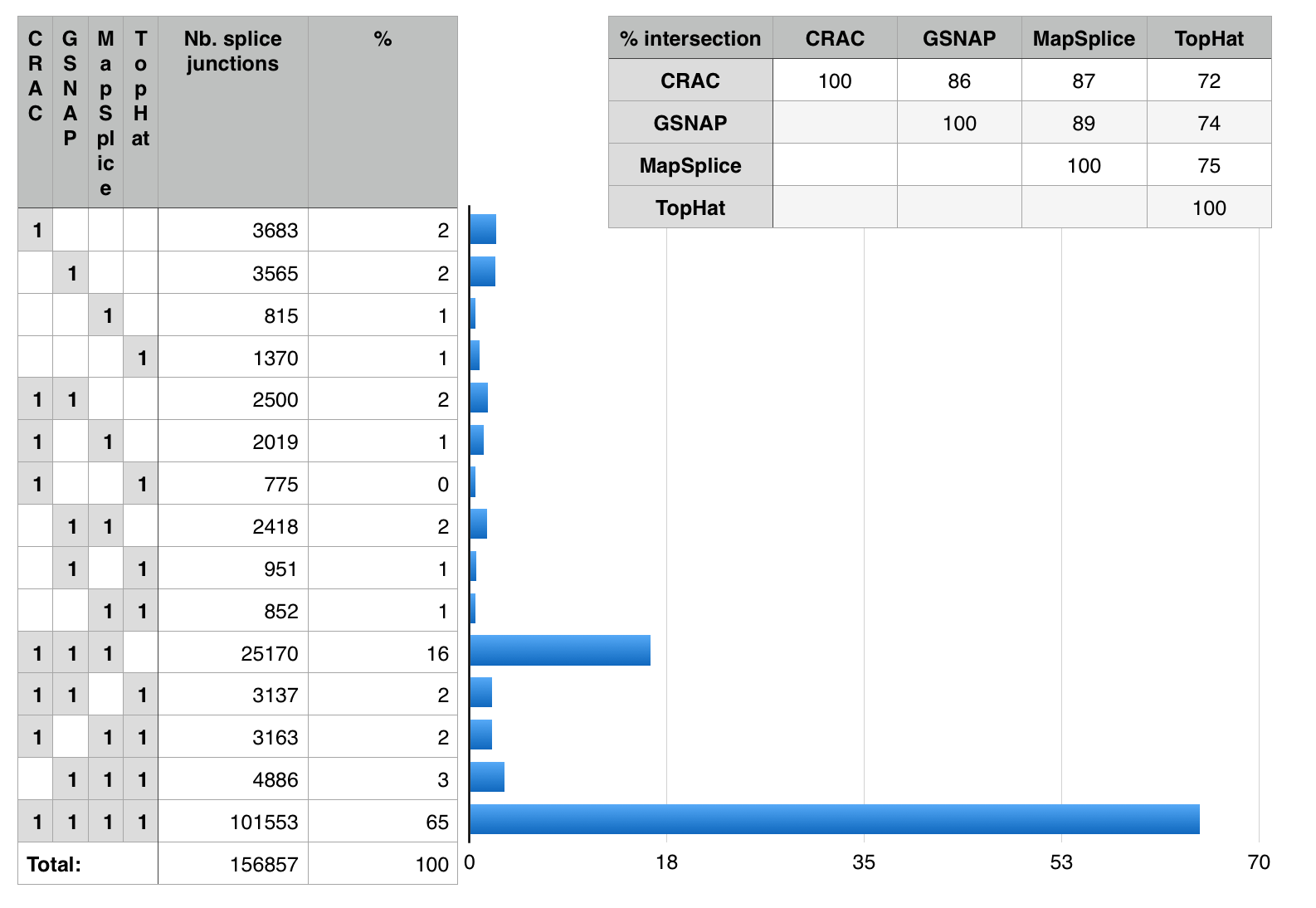
Fig. 2: Investigating the Venn diagram. These numbers are readily computed using the “sumproduct” function in your favorite spreadsheet.
This representation takes a bit more space (when more than two categories are present) and is fundamentally less colorful, but it does serve a purpose! So next time, just before launching Venny (here), ask yourself what is the most convenient presentation for your overlapping data.
Venn diagrams become almost counterproductive once you go beyond 3 sets.