

Hi everyone,
Today I will introduce formattable.
This package is designed for applying formatting on vectors and data frames to make data presentation easier, richer, more flexible and hopefully convey more information.
We will see how to use this package to interpret your data at a glance, with just a few lines of code (You can follow along below as well as check all the code in my git). Before going further, I will specify that this package is generally used to display tables in a dynamic document (like a report) generated by an other package like R markdown. Here I choose to talk only about the first package. The second package could be the subject of another post. Pending, you should found a lot of help on the R markdown web page and other (like on stackoverflow).
Working data:
To discover this package, I suggest using real data published by Céline M. Laumont and et al. in Global proteogenomic analysis of human MHC class I-associated peptides derived from non-canonical reading frames. We will use the table found in the Supplementary Data 2, which presents the genomic and proteomic features of all cryptic MAPs.

Figure 1. An Excel version of a few lines of your table.
Create your first formattable :
First, we need to start by:
-
- installing the package in your R (or RStudio):
install.packages("formattable") -
- loading your data:
#Loading the library before using it
library(formattable)
# Loading the data
tab = read.table("./Supplementary_table_2_CrypticMAPs.txt", header=T, sep='\t', stringsAsFactors=F)
# Select some columns like in the excel format
tab_reduce = tab[, c(1, 2, 3, 4, 6, 5, 7, 9, 11, 18, 15, 19, 22, 23, 24, 25)]
# Change some column names to reduce the length of some labels
colnames(tab_reduce) = c("peptide_sequence", "chr", "start", "stop", "strand",
       "length", "spliced", "frame", "best_IC50", "gene_id", "gene_FPKM",
       "mascot_score", "intensity_1", "intensity_2", "intensity_3", "intensity_4"
)
And now, creating a formattable with your data is as straightforward as calling the function formattable:
#create formattable
widget_formattable = formattable(tab_reduce)
#display the table in your web browser or in RStudio (if you use it)
widget_formattable
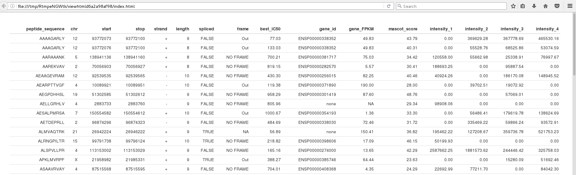
Figure 2. Visual result of calling the formattable function on your data. All data are available on the web page via scrolling!
Fix the format of ‘gene_FPKM’ column:
formattable has several functions to format typical numeric vectors such as percent, comma, currency, accounting and scientific. These functions basically create numeric vectors with predefined formatting rules and parameters. For more details, I invite you to check this web page.
In your case, the column ‘gene_FPKM’ is automatically set to vector of ‘chr’ by read.table because it contains some ‘none’ values. We need to change it to a numeric vector, before going further.
# A warning message will tell us that 'None' values are replaced by NA. -> it's ok.
tab_reduce$gene_FPKM = as.numeric(tab_reduce$gene_FPKM)
# Using 'accounting' to format numerical values with 2 digits
tab_reduce$gene_FPKM = accounting(tab_reduce$gene_FPKM)
Display some graphical elements as columns values:
Let start by using built-in functions like color_tile(), color_bar(), area() and normalize_bar(), to makes it easier to compare the magnitude of the values found in specified columns (see Figure 3).

Figure 3. Add some graphical elements depending on the columns values.
Notice that for IC50 we are interested in highlighting the lowest scores, in comparison to gene’s FPKM, mascot’s score and intensity where we want to highlight the highest values. It’s also important to know that intensity values need to be compared for each peptide. Thus, all intensity columns need to share the same scale, this is done by the area function.
All of these constraints can be done by adding a list of graphical elements identified by the name of columns where we want to apply each one: ‘best_IC50’, ‘gene_FPKM’, ‘mascot_score’ and the four ‘intensity_x‘.
# Using built-in functions to display graphical elements
widget_formattable = formattable(tab_reduce, list(
	best_IC50 = color_tile('lightblue', 'white'),
        # We need to toggle na.rm to True, because we have some NA in the data
	gene_FPKM = color_bar('red', na.rm = TRUE),
	mascot_score = color_tile('white', 'orange'),
        area(col=c(intensity_1, intensity_2, intensity_3, intensity_4)) ~ normalize_bar("pink")
))
widget_formattable
To go futher:
The package formattable allows us to add graphical elements by adding HTML elements, mainly with <span> markup, throwing the generic function ‘formatter‘. A simple example using this function can be shown : displaying strand values in bold, is achieve by adding this code in the list:
strand = formatter('span', style=style(font.weight = "bold"))With this generic function and ifelse, we can create our own functions:
- To change the visual of a column depending on values in an other one:
none_formatter <- function() {
    formatter("span",
        style = ~ style(color = ifelse(gene_id == "none", "blue", "black"))
    )
} - Display colored check and cross icons, to replace boolean values:
icon_formatter <- function() {
    formatter("span",
        style = x ~ style(color = ifelse(x, "green", "red")), x ~ icontext(ifelse(x, "ok", "remove"), "")
    )
}
- Modify a built-in function to avoid side effect on ‘NA’ values (see Figure 3):
color_bar_NA <- function(color = "lightgray", fun = "proportion", ...) {
    fun <- match.fun(fun)
    replace_na <- function(fun, x, ...) {
        x[which(is.na(x))] = 0
        return(fun(as.numeric(x), ...))
    }
    formatter("span",
        style = function(x) style(display = "inline-block",
            direction = "rtl",
            "border-radius" = "4px",
            "padding-right" = "2px",
            "background-color" = csscolor(color),
            width = percent(replace_na(fun, x, ...))
        )
    )
}
All these modifications applied on the data with the code below result in the table seen in Figure 4.
# We can also add an alignment for each column with a vector of 'char'
align_column=c("l","r","r","r","c","r","c","l","r","r","r","r","r","r","r","r")
widget_formattable = formattable(tab_reduce, align=align_column, list(
	peptide_sequence = none_formatter(),
	strand = formatter('span', style=style(font.weight = "bold")),
	spliced = icon_formatter(),
	best_IC50 = color_tile('lightblue', 'white'),
	gene_id = none_formatter(),
	gene_FPKM = color_bar_NA('red'),
	mascot_score = color_tile('white', 'orange'),
	area(col=c(intensity_1, intensity_2, intensity_3, intensity_4)) ~ normalize_bar("pink")
))
widget_formattable
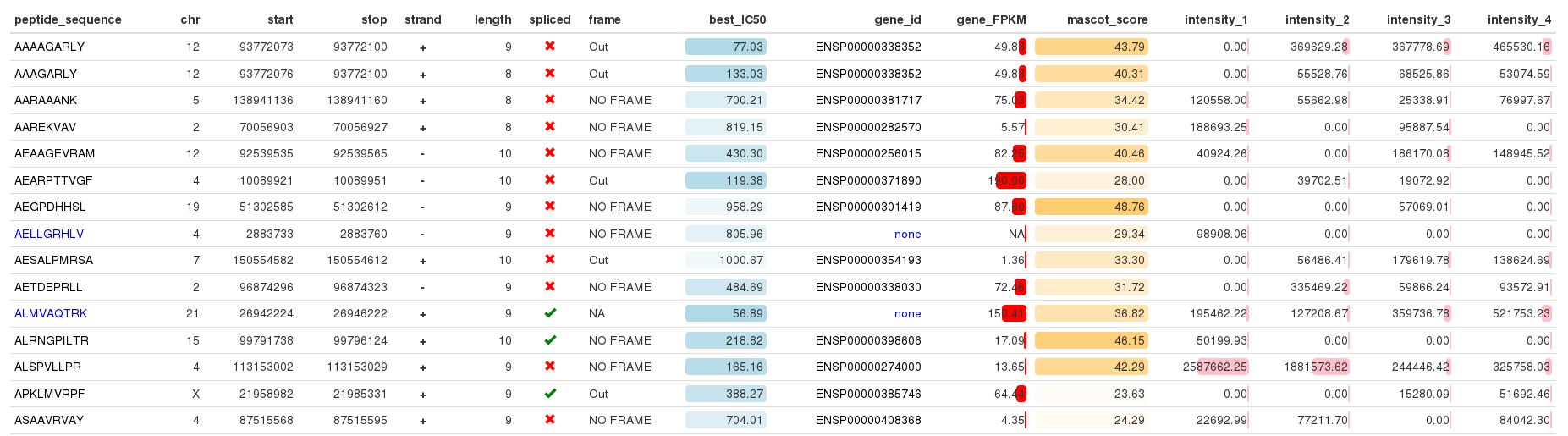
Figure 4. Whaou!!!
Export in HTML, JPEG, PNG or PDF files:
The formattable package allows exporting your table in an HTML format only. However, there exists a solution to export in JPEG, PNG or PDF format. This solution is a little more complex so we will start by the HTML version.
Again, it’s really simple, we just need to replace the ‘formattable’ function by ‘format_table’ to obtain the HTML text of your table. To this text, we need to add an ‘html_header‘ to specify the css style, which is the visual style we want to apply on the table.
html_header="
<head>
<meta charset=\"utf-8\">
<meta name=\"viewport\" content=\"width=device-width, initial-scale=1\">
<link rel=\"stylesheet\" href=\"https://maxcdn.bootstrapcdn.com/bootstrap/3.3.7/css/bootstrap.min.css\">
</head>
<body>
"

html_table = format_table(tab_reduce, align=align_column, list(
	peptide_sequence = none_formatter,
	strand = formatter('span', style=style(font.weight = "bold")),
	spliced = icon_formatter,
	best_IC50 = color_tile('lightblue', 'white'),
	gene_id = none_formatter,
	gene_FPKM = color_bar_NA('red'),
	mascot_score = color_tile('white', 'orange'),
	area(col=c(intensity_1, intensity_2, intensity_3, intensity_4)) ~ normalize_bar("pink")
))

write(paste(html_header, html_table, sep=""), "./Supplementary_table_2_CrypticMAPSs.html")
It works without the ‘html_header‘ but without it, we will loose icon representation and the table will be displayed in a ‘spartan’ format.
To finish, let see how we can export the table in JPEG, PNG and PDF. To add this functionality, we need a new function called export_formattable and two packages, let’s start by installing them:
install.packages('htmltools')
install.packages('webshot')
library(htmltools)
library(webshot)
webshot::install_phantomjs()

# Export a Formattable as PNG, PDF, or JPEG
# check: https://github.com/renkun-ken/formattable/issues/26
export_formattable
Now we can export our table using ‘widget_formattable‘ object, like this:
export_formattable(widget_formattable, "./Supplementary_table_2_CrypticMAPSs.png")
# For the PDF format, colours are not available, it's an known issue.
# See: https://github.com/renkun-ken/formattable/issues/53
export_formattable(widget_formattable, "./Supplementary_table_2_CrypticMAPSs.pdf")
export_formattable(widget_formattable, "./Supplementary_table_2_CrypticMAPSs.jpeg")
To conclude:
I found this package very efficient to display a data.frame in a useful format into a web browser (compare to View() or head()). Moreover, build-in fonctions: color_tile(), color_bar(), area() and normalize_bar() should help you analyse the data in a glance. If it’s not enough, we’ve also shown how to customize some graphical elements. It’s a little more tricky but with the examples in this blog plost, you should be able to achieve your goal. For the IRIC’s staff, it’s also possible to ask some help from your favorite platform ;). In the end, we saw there was an issue related to exporting your colored table in a PDF format. Pending a fix to this issue, you can export in PNG and use another software to transform the PNG into a PDF file or use the HTML format.
I hope you have appreciated this post, and I wish you much fun with formattable.
Can you post your code for icon_formatter please?
Hi Alireza,
For unknown reasons this part has been deleted and no one had noticed it.
Thank for your feedback, which allowed me to corrected this part.
Just in case, all my code is also available on a git repository.
The link is in the introduction.
Hi Éric,
Wonderful sharing! Thank you so much. But, do you know how to add background color for specific rows?
Hi Kenny,
Not to my knowledge.
Maybe you could use formattable with formatStyle().
Oh I see. Thanks!
Excellent documentation, thank you.
Wow this is great! Thanks for doing this article
Hi Eric,
This was quite helpful. But, do you know how to hide headers of the table? I tried reducing the font size to zero and even changing the color to white. Nothing seems to work!
Thank You so much.
Hi Atanshi,
I’ve never tried to hide headers.
Have you check this solution on stackoverflow ?
tags$head(tags$style(type = "text/css", "#table2 th {display:none;}"))I hope it will enough to help you.
Best,
Eric.