

Boxplots are everywhere! Publishers like boxplots. But ask some people and most don’t even know what a boxplot represents! Recently I wanted to examine gene expression data between two samples for a certain gene. The gold standard to look at it would be *drum roll*… A boxplot!
Interesting fact #1: Did you know a boxplot is called a “box and whiskers plot” as well? Let’s take a look!
A boxplot is easily generated in the analysis software R and its interpretation is intuitive. However, not many can tell you exactly what the intricate set of lines represents.
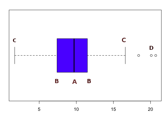
Let’s go over it together!
A- This line is the median
What is a median? If you don’t know, keep reading! If you would line up all values in order from lowest to highest, the median would be the middle value. For example: 1,5,6,12,17,18,21. The median here is 12. The middle value! Careful not to confuse with the mean, which in this case would be 11.42.
But then, what do we do with an even number of values? 1,3,4,5,19,156. The median here is the mean of the two middle values! So $(4+5)/2 = 4.5$. Again, note that the mean in this case would be 31.33.
B- These two lines are the separation between the 1st and 3rd quartiles.
Quartiles are sort of like the median, but in four groups. So the first quarter of the values (Q1 or lower quartile), and the third quarter (Q3 or upper quartile).
C- Whiskers
In a Tukey boxplot the lines represent 1.5*IQR (interquartile range). This curious value is the distance (difference) between the values of Q3 and Q1, which are respectively 3rd and 1st quartile. In other boxplots, the whiskers represent the maximum and minimum values.
D- Outliers
And then there are these guys. They are not plotted by the 1.5*IQR lines (whiskers) and are not included in the main box. They give a little insight on the sample distribution. In some boxplots they are not plotted.
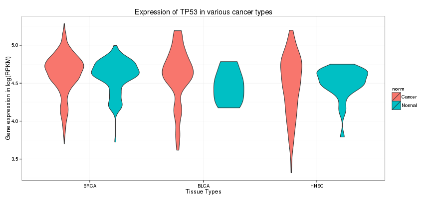
Other times, violin plots are used. These show the distribution of the data set. The more there are entries with the same value, the wider the plot gets at that coordinate. Here we are looking at the gene expression of the TP53 gene in cancer vs normal samples for Breast (BRCA), Bladder (BLCA) and Head and Neck (HNSC) cancers.
Lets go further!
IQR is useful to check for data set normality (Gaussian distribution). Say you have your two 1st and 3rd quartile values Q1 and Q3 and your standard deviation calculated. If the distribution is normal, the Q1 value should equal the sum of the mean ($\overline{x}$) and -.067 times the standard deviation ($\sigma$) like so : $Q1 = \overline{x}+(-0.67*\sigma)$. And the same goes for the Q3 value, except its 0.67 times the standard deviation: $Q3 = \overline{x}+(0.67*\sigma)$
Boxplots are indeed a way to get to know your data. Let it talk about itself, you just need to listen…and maybe ask the right questions!
Leave A Comment